Recently, Penguin announced that it was bringing out a new edition of Charlie and the Chocolate Factory. So far, so ordinary. Except that the new cover is THIS:
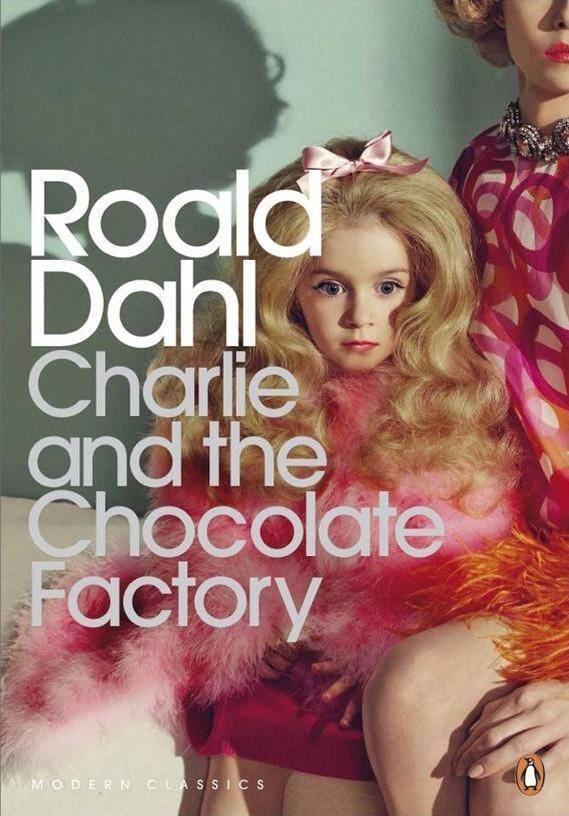
A lot of people have expressed opinions about it. Some people have claimed it’s a ‘sexualised’ cover; others that it has nothing to do with the story. I assumed that it was a depiction of Verruca Salt, but Penguin has apparently said that it’s not Verruca or Violet Beauregarde, but instead represents unhealthy parent/child relationships.
There’s no denying that CatCF is chock-full (ha! see what I did there?!) of unhealthy parental role models. Pretty much everyone except Charlie himself has a useless parent. So the concept isn’t that silly. But the biggest complaint has been: ‘This is a CHILDREN’S book. Why is this cover targeting adults?’ Because it is, really. This is not a cover for a children’s book. I’m not saying it wouldn’t appeal to children, because OBVIOUSLY it will appeal to girls. I expect my own six-year-old would be attracted to this cover. There she is, the ultimate Disney Princess: a girl far too young to be wearing eyeliner that thick, dwarfed in feathers and backcombed to perfection. Her expression is blank. She has no personality. Her mother is sitting protectively next to her, casting an ominous shadow on the wall.
In fact, typing all this out makes me realise the real problem I have with this cover. It’s buying into the whole cute-little-girls-who-look-pretty-and-are-there-as-objects thing. Penguin could have done this with a small boy; after all, the book is full of equally objectionable boy characters, and of course there’s Charlie himself, who could have been photographed staring blankly out of poverty…but no. That isn’t saleable, is it? Cute little girls in pink, who are made up to look like princesses but have no personality or thoughts of their own – THEY are attractive. Because we’re trained to think they are. So in a way, it IS a sexualised cover. Not overtly, of course – there are no fishnets or cutesy pouts. But it is a little girl, dressed and made up inappropriately for her age, and placed purely as an object. She’s not being a little girl. She’s being a thing.
A lot of Dahl’s work is really dark. I re-read The Witches a while back and was astonished how much bleakness and horror it contains. You’d not get that past Sales and Marketing these days – and yet kids connect with bleakness and darkness. You only have to look at the stories that have stayed with people to know that a healthy dose of DEATH and AWFULNESS is kind of good to have in children’s books. It helps kids to explore that side of themselves. And don’t tell me they should be protected. All my friends who are parents have had to deal with questions about ‘what happens when I die?’ ‘Who will die first, me or you?’ ‘If I was run over, which bits of me would be squished more?’ Kids are OBSESSED with horrible things.
But I don’t think this cover is a good one. I see the concept: I get it. I even think it’s clever. But as a female of 38, raising two daughters in a massively sexist world (still), I don’t like it. It’s another egg into the basket of nasty stuff that girls have to deal with. The cover taps into an adult’s view of the book, not a child’s. And good God, haven’t we got enough inappropriate material about young girls circulating among adults at the moment as it is?
Those people who are saying, ‘This is a kids’ book! Why is it being marketed to adults?’ have an excellent point. The adults who will buy it – are they buying it for themselves? If they are – why? For nostalgia? They’d be more likely to want the version with the Quentin Blake illustrations if they want to recapture their childhood memories of the book. They sure won’t be buying it for their sons: no self-respecting primary-aged boy would pick up a book with this cover. So who will they buy it for? Here’s the scary thought: will they be buying it for their daughters? In which case, what message is it sending to their girls? Yet again, we have a dutiful, lacking-any-kind-of-spark girl, who has been painted to fit society’s expectations of beauty. And her mother is presumably responsible for this.
No, no, and again no. I don’t suppose Penguin will think again. But they should. If they have any concept at all of sexual equality and visual messages.

Hi. I was shocked to see the cover! It’s hideous! “Did Charlie join a beauty pageant?” That was my first thought. I totally agree with you on the cover being sexualised. The clothes are wrong, the facial expression seems vague like she’s tolerating parental abuse of some sort. It’s a shame that this cover got approved by Penguin.
I agree in that I don’t think it’s an appropriate cover for children. I don’t think they’ll get it, either, and yeah, some little girls might even find it appealing, for all the reasons we woudln’t want them to. But as an adult book, we ‘get’ that she’s an abused toy figure, and I like the way it challenges many adults’ misremembering of a cosy, nice story.
Anyway, I wrote more about it here: http://jabberworks.livejournal.com/656024.html